¶ Extension Arguments
The Extension Args Class in Assistant allows you to define the input parameters for your extension's task. These parameters are crucial for specifying the data and settings required for your extension to perform its function. The arguments you define in this class are presented as user interface (UI) controls within Assistant, making it easy for users to input the necessary data.
¶ Defining Extension Arguments
The Extension Args Class should contain properties that define the input parameters for your extension. These properties can have various data types, depending on the type of information you need from the user. Assistant automatically generates UI controls for these properties, simplifying user interaction. Here's how you can define these properties:
public class ExtensionArgs
{
    [Description("Description of the input field")]
    [ControlData(ToolTip = "Tooltip for the input field")]
    public DataType PropertyName { get; set; }
}
-
Description Attribute: This attribute is used to provide a label or description for the input field. It's displayed as a user-friendly name for the property.
-
ControlData Attribute: This attribute allows you to provide additional information, such as tooltips, to the UI control associated with the property.
-
DataType: Replace this with the actual data type of your input property. Assistant will generate the appropriate UI control based on this data type.
The following example:
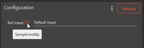
public class ExtensionArgs
{
    [Description("Text input")]
    [ControlData(ToolTip = "Sample tooltip")]
    public string TextInput { get; set; } = "Default input"
}
Produces this UI in Assistant Extenion Configuration:
¶ Data Types and Control Generation
Assistant automatically generates UI controls based on the data type of the property. For instance:
-
A
stringproperty generates a text box. -
An
integerproperty generates an input field for whole numbers. -
A
DateTimeproperty generates a date and time picker.
You can also use attributes to customize the UI controls: -
[ControlType]Attribute: Use this attribute to specify a custom control type if you want to override the default control generated by the data type.
¶ AutoComplete and Drop-Down Lists
Assistant supports auto-complete functionality and drop-down lists for certain data types. This feature is useful for providing predefined options to users. To enable auto-complete or drop-down lists:
-
Use the
[RevitAutoFillAttribute]attribute to specify the data source. For example, you can use it to populate a text field with phases from the active Revit file. -
For lists or enums, you can use
[AutoFill]with a specified SortOrder to populate a drop-down list. -
Attributes like
[RevitAutoFill]and[AutoFill]allow you to customize the auto-fill options, including sorting and filtering.
¶ Custom Autofill collectors
The [CustomAutoFill] attribute is used to write your own logic to collect items for controls. You can implement custom autofill collectors for Revit (CustomRevitAutoFill) and Tekla (CustomTeklaAutoFill) extension types and the generic one [CustomAutoFill] works for all extension types.
Here is an example for CustomAutoFill:
public class GreetingArgs
{
    // This attribute adds a custom autofill collector to the property.
    [CustomAutoFill(typeof(CustomAutoFillCollector))]
    public string Name { get; set; }
}

public class CustomAutoFillCollector : IAsyncAutoFillCollector<GreetingArgs>
{
    public async Task<Dictionary<string, string>> Get(GreetingArgs args, CancellationToken cancellationToken)
    {
        var result = new Dictionary<string, string>();

        // Get the users name from environment variables.
        var name = Environment.UserName;
        result.Add(nameof(args.Name), name);

        return await Task.FromResult(result);
    }
}
The GreetingArgs class defines a property Name that is decorated with the [CustomAutoFill] attribute. This attribute specifies that a custom autofill collector (CustomAutoFillCollector) should be used for the Name property.
The AutoFillCollector class implements the IAsyncAutoFillCollector<ExtensionArgs> interface, providing autofill data. Here, we've simulated fetching user name from environment variables.
¶ Custom Control Properties
In some cases, you may want to customize the appearance or behavior of UI controls. This can be achieved through attributes:
[ControlSettings] Attribute: This attribute allows you to set various properties for the control. For example, you can change the foreground color or the maximum height of a list control.
[FileExtension] Attribute: Use this attribute to specify valid file extensions for file-related controls like file open and save dialogs.
¶ Authentication and API Integration
If your extension requires access to external services or APIs, you can use attributes like [Authorization] and [BaseUrl] to configure and provide login credentials and base URLs.
For detailed instructions on utilizing this feature within your Assistant extension, please refer to the dedicated Pre-Authorized HTTP Clients page.
¶ Example args class
Here's an example of the ExtensionArgsClass:
public class ExtensionArgs
{
    [Description("Description of the input field")]
    [ControlData(ToolTip = "Tooltip for the input field")]
    public string TextField { get; set; }

    [ControlData(ToolTip = "Date and time picker")]
    public DateTime DateTimeField { get; set; }

    [ControlData(ToolTip = "Dropdown list with predefined options")]
    [AutoFill(SortOrder = SortOrder.SortByAscending)]
    public CustomEnum EnumField { get; set; }

    [ControlData(ToolTip = "Control to select a directory")]
    [ControlType(ControlType.Browse)]
    [ControlSettings("SelectFolder", "true")]
    public string DirectoryField { get; set; }

    [Authorization(Login.Autodesk)]
    [BaseUrl("https://developer.api.autodesk.com/")]
    public IExtensionHttpClient AutodeskClient { get; set; }
}
By defining your extension's arguments in the ExtensionArgsClass, you enable users to provide input parameters through a user-friendly interface, making it more accessible and user-centric.
Remember to document your specific extension's requirements and expected input parameters within this class for clarity and ease of use.
¶ Extension Control Snippets
Visual Studio Code (VS Code) offers code snippets, which are templates for quickly inserting commonly used code segments into your files. These snippets enhance productivity by eliminating repetitive typing.
In your extension template, a set of pre-defined code snippets is available for common development tasks. They allow you to effortlessly create specific code structures and adhere to conventions. For instance, typing control-type-browse and pressing Tab generates code for a file browsing control with a tooltip:
[Description("Browse for file")]
[ControlData(ToolTip = "Sample tooltip")]
[ControlType(ControlType.Browse)]
[FileExtension("json")]
[FileExtension("*")]
public string BrowseForFile { get; set; }
These snippets save time and ensure consistent coding practices in extension development.
¶ A large collection of examples
// Sample user interface for extensions
public class ExtensionArgs
{
    [Description("TextBox control")] // Use this attribute for label content
    [ControlData(ToolTip = "Tool tip sample for controls")]
    public string TextBoxControl { get; set; } = "Default value";

    [Description("Read-only control")] // Use this attribute for label content
    [ControlData(ToolTip = "Read only TextBox control with sample value")]
    [ControlSettings("Foreground", "Red")] // Use this to set properties to controls
    public string ReadOnlyControl { get; } = "Read Only TextBox value";

    [ControlData(ToolTip = "TextBox control with Phases in active Revit file as auto complete sorted by ascending order.")]
    [RevitAutoFillAttribute(RevitAutoFillSource.Phases, SortOrder = SortOrder.SortByAscending)]
    public string TextBoxWithAutoComplete { get; set; }

    [ControlData(ToolTip = "Option control with Revit phases as possible values")]
    [RevitAutoFillAttribute(RevitAutoFillSource.Phases)]
    [ControlTypeAttribute(ControlType.Option)]
    public string OptionControl { get; set; }

    [ControlData(ToolTip = "ListBox control with Revit built in enums")]
    [AutoFill(SortOrder = SortOrder.SortByAscending)]
    [ControlSettings("MaxHeight", "200")] // Set maximum heigt for the control
    public List<BuiltInParameterGroup> ListBoxWithEnum { get; set; }

    [ControlSettings("ToolTip", "List of strings with autocomplete")]
    [ControlSettings("MaxHeight", "200")] // Set maximum heigt for the control
    [RevitAutoFill(RevitAutoFillSource.ByCustomFilter, RevitType = typeof(View), RevitBuiltInCategory = "OST_Sheets", WhereElementIsType = false, ParameterName = "Sheet Number")]
    public List<string> ListControl { get; set; }

    [ControlTypeAttribute(ControlType.ListBox)]
    [RevitAutoFillAttribute(RevitAutoFillSource.Categories)]
    [ControlData(ToolTip = "ListBox control with CompactMode set to true")]
    [ControlSettings("CompactMode", "true")] // or false, defaults to false
    public List<int> Categories { get; set; }

    [ControlData(ToolTip = "ComboBox control with custom enums")]
    public CustomEnum CustomEnumControl { get; set; } = CustomEnum.CustomEnumValue1;

    [ControlData(ToolTip = "ListBox control with Revit built in enums")]
    public List<CustomEnum> CustomEnumListControl { get; set; }

    [ControlTypeAttribute(ControlType.Browse)]
    [FileExtension("json")]
    [FileExtension("*")]
    [ControlData(ToolTip = "Open file dialog control")]
    public string BrowseForFile { get; set; }

    [ControlType(ControlType.Browse)]
    [ControlSettings("SelectFolder", "true")]
    [ControlData(ToolTip = "Open file dialog control to select a directory")]
    public string BrowseForDirectory { get; set; }

    [ControlTypeAttribute(ControlType.Save)]
    [FileExtension("json")]
    [FileExtension("*")]
    [ControlData(ToolTip = "Save file dialog control")]
    public string SaveFile { get; set; }

    [ControlData(ToolTip = "Dictionary control")]
    [RevitAutoFill(RevitAutoFillSource.FamilyAndType, SortOrder = SortOrder.SortByDescending)]
    public Dictionary<string, string> Dictionary { get; set; }

    [Description("Date")]
    [ControlSettings("ShowTime", "true")] // or false, defaults to true if not provided
    [ControlData(ToolTip = "Date and time picker control")]
    public DateTime DateControl { get; set; }

    [Description("Radio button")]
    [ControlData(ToolTip = "Radio button control with enum as options")]
    [ControlSettings("Orientation", "Vertical")] // or Horizontal
    [ControlType(ControlType.RadioButton)]
    public RadioButton RadioButtonControl { get; set; }

    [Description("Element Id")]
    [ControlData(ToolTip = "When the datatype is int and the control has a autofill source, you will get ElementId of element")]
    [RevitAutoFill(RevitAutoFillSource.FamilyAndType, SortOrder = SortOrder.SortByAscending)]
    public int ElementId { get; set; }

    [Description("Element UniqueId")]
    [ControlData(ToolTip = "When the datatype is string, controltype is ComboBox and the control has a autofill source, you will get UniqueId of element")]
    [ControlType(ControlType.ComboBox)]
    [RevitAutoFill(RevitAutoFillSource.FamilyAndType, SortOrder = SortOrder.SortByAscending)]
    public string ElementUniqueId { get; set; }

    [Description("Multiline textbox")]
    [ControlSettings("IsMultiline", "True")]
    [ControlSettings("MinLines", "5")]
    [ControlSettings("MaxLines", "10")]
    [ControlData(ToolTip = "Control with multilines")]
    public string MultiLineText { get; set; }

    [Description("Filter control")]
    [ControlSettings("UseActiveDocument", "True")]
    [ControlSettings("AllowMultipleDocuments", "False")]
    [ControlData(ToolTip = "Control to define a slection filter")]
    public FilteredElementCollector FilterControl { get; set; }

    [Description("Filter control with multiple documents")]
    [ControlSettings("AllowMultipleDocuments", "True")]
    [ControlData(ToolTip = "Control to define a slection filter")]
    public Dictionary<Document, FilteredElementCollector> FilterControlMultiDocument { get; set; }

    [Description("Custom Revit collector")]
    [CustomRevitAutoFill(typeof(CustomRevitAutoFillCollector))]
    [ControlType(ControlType.ComboBox)]
    public string CustomRevitCollector { get; set; }

    [Description("Custom Revit collector")]
    [CustomAutoFill(typeof(CustomAutoFillCollector))]
    [ControlType(ControlType.ComboBox)]
    public string CustomCollector { get; set; }

    [Authorization(Login.Autodesk)]
    [BaseUrl("https://developer.api.autodesk.com/")]
    public IExtensionHttpClient AutodeskClient { get; set; }
}